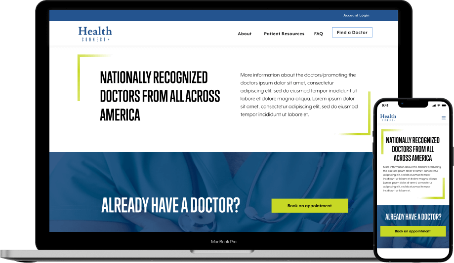
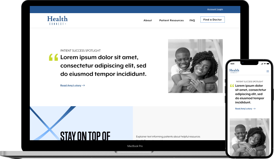
Responsive Web Design
About Health Connect+
Health Connect+ is an online platform that connects patients with healthcare providers in their local communities.
Challenge
Establish trust and design for accessibility while promoting the Health Connect’s key features on the homepage.
Choosing Styles
About the Brand
Health Connect+ identifies as a company that is focused on people’s well-being. Their brand is modern, clean, soothing, and friendly.
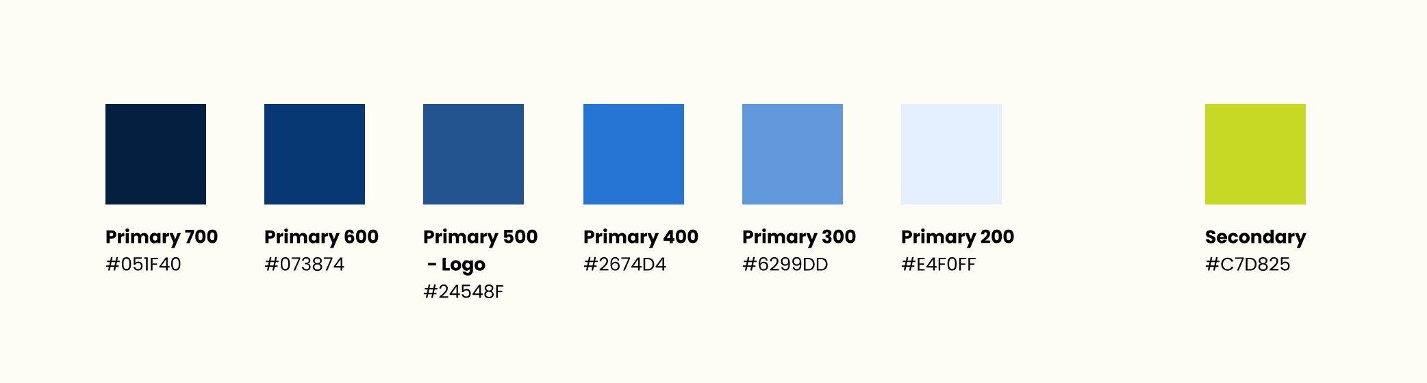
Colors
I was provided with the below logos.
I decided to use the blue logo (left) because this color has a higher contrast ratio against a white background than the light green.

Logo options for Health Connect+
With these two colors in mind, I created a color palette for my design with blue as the primary color and green as the secondary color.
Typography
I wanted the heading typography to both mimic part of the logo and create a clean, modern feel.
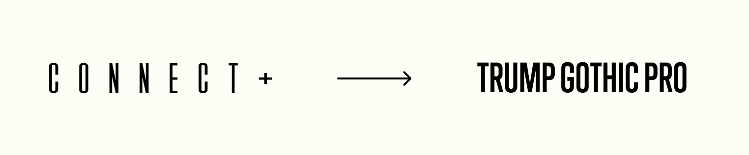
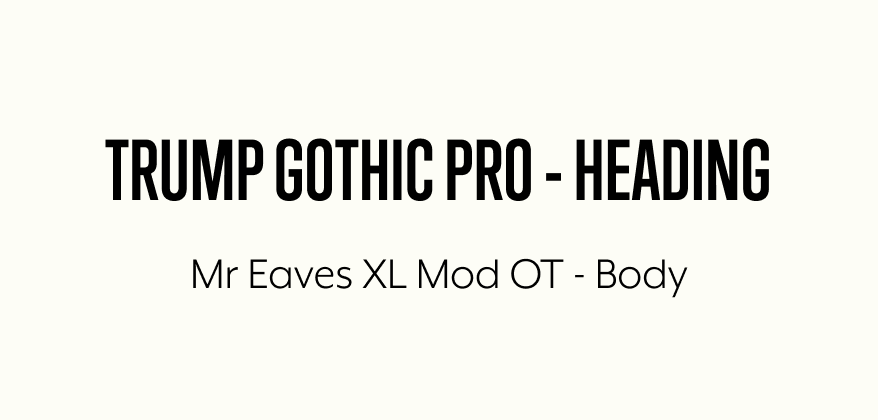
For the body, I wanted the type to be softer than the heading to add some contrast throughout the design.