
Timeline: January-April 2023
Team: 4 UX designers
My Role: UX Design, UI Design, User Research
Client: Maro
Project Type: Mobile iOS app design
Redesigning an App to Help Improve Pediatric Healthcare
Background
Maro, a children’s health-focused EdTech startup, launched the Maro Parents app in 2020 to help families recognize mental health challenges in their child, navigate tough conversations, and get the support they need to ensure their child is successful.
My Role
I led 3 UX designers in the redesign of Maro Parents from January to April of 2023. Tasks included:
User Research: planning, conducting, and analyzing remote user interviews and usability testing
Heuristic, Comparative, and Competitive analyses
Wireframing
Defining foundational styles and component library
Illustrations
High fidelity designs
Prototyping
If you’re most interested in reading about color choices and illustrations, click here.
We redesigned the whole Maro Parents app, however, this case study is centered around the 3 areas I dedicated the most time to.
Goal
Help parents recognize mental illness in their children early, access curated parenting materials, and feel supported by engaging with the Maro Parents App.
Scope
Based on feedback from user interviews and discussions with the client, we narrowed down 3 main areas of focus for this project:
Design a simple, flexible behavior tracking process to help parents identify mental illness early.
Organize content in a way that is easy for busy parents to find and use.
Establish a community-feel within the app without the budget for full-scale moderation to help parents feel supported.

Simple, Flexible Behavior Tracking
During user interviews, we discovered that parents typically track their child’s health using flexible, familiar methods, such as pen and paper or the Notes app on their phone.
Opportunity:
…how might we make behavior tracking valuable, simple, and flexible enough for parents to change how they currently record their child’s health?
Redesigning The Flow
The existing app’s behavior tracking created a lot of friction for parents due to accessibility issues, redundant prompts, and ambiguous questions.
To remove this friction and encourage parents to use the app over their current methods, I decided to:
Create an external trigger to provide parents with a visual reminder to add details about their child’s day.
Customize recommended content based on collected data because parents are most concerned with information that is applicable to their situation.
Simplify the process because the less time required for a task, the more likely parents will be able to complete the task.
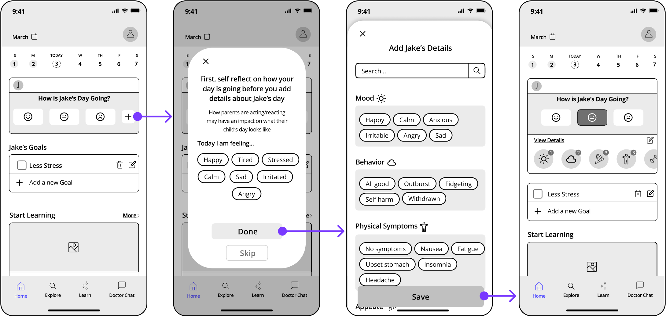
The initial design and flow for behavior tracking that we did usability testing on.
Optimizing Behavior Tracking
After usability testing I made the following changes:
More customizable tracking options because parents mentioned that some categories (e.g. homework) are more useful than others due to their child’s age.
Additional prompting to add details because parents hesitated when asked: “How would you expect to add more details about your child’s day?”

High fidelity screens with prompting added to the behavior tracking flow.

Content Strategy
Heuristic analysis uncovered that the original app’s Explore section was difficult to navigate because it lumped expert-written articles and modules together, and did not allow parents to search or filter through content.
To help parents navigate content, I decided to:
Split articles and modules into separate tabs in the bottom navigation because articles are individual pieces of information while modules are training-style activities that require a higher level of commitment to complete.
Categorize the landing pages of Explore and Learn because this will help parents find content that applies to them and discover new content.
Create the option to filter by age group because parents expressed that they have trouble finding comprehensive parenting information as their children get older.
Design for Explore

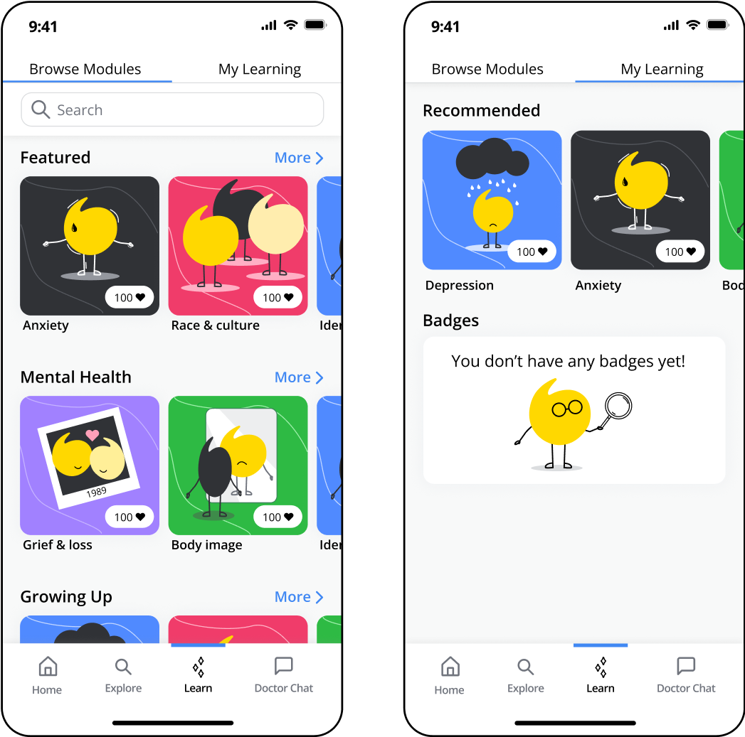
Reorganization of the Articles screens with sort/filter options.
Design for Learn
Reorganization of the Modules screens.
Original App Design
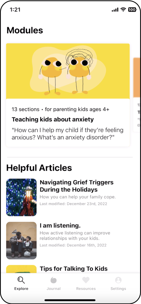
Articles and modules were originally combined under the Explore tab, with no “search” function.
A Community Feel
We discovered that parents lean on communities both in-person and online for support and to ultimately feel less alone in their parenting journey during user interviews.
The client wanted to add a “community-feel” to the app, but they would not have the budget for community moderation in the near future.
Opportunity:
…how might we help parents feel less alone in their parenting journey without allowing them to interact directly with other users?
Ask The Experts
I created a section called ‘Expert FAQ’ within the Explore tab. This way, parents are asking Experts their questions instead of other parents.
Parents still receive advice and learn from others’ challenges, but are not interacting directly with other app users.
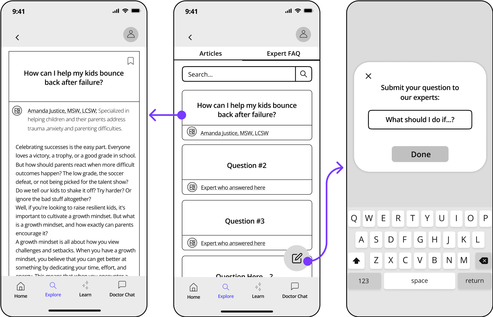
Initial design for the Expert FAQ section.

Parents expressed their excitement towards the our Expert FAQ section during usability testing. After sharing this positive feedback with the client, we agreed to add voting to the Expert FAQ’s because we wanted to provide the client with a foundational system that determines which submitted questions parents are most interested in receiving expert responses for.
Optimizing Explore
The Final Design
During iteration, I struggled to add the voting capability because I tried to keep Articles separate from the FAQ’s within the Explore tab, as they had been throughout the design process.
I soon discovered that the Explore tab should be split into sections based on whether users are consuming content or contributing to content instead of by content type.
Outcome
A more personalized landing screen because parents mentioned that they are most interested in content that is recommended for them.
Added section: Community Questions - a section specifically made for voting on or submitting questions (content contribution).
A burger menu to navigate between sections to help parents easily switch between consuming content in the Explore Home and contributing to content in Community Questions.

The Explore landing screen from before and after usability testing.

Flow for how parents access Community Questions to vote on or submit content.
Validating The Final Design
After some additional testing focused solely on the Explore tab, we discovered that all participants understood the concept of Community Sourced Questions and found the browsing and overall look of the Explore tab familiar and intuitive.
“I often find browsing in apps confusing, but I was happy to see how simply this was laid out.”
— Danielle
Conclusion
Our goal was to help parents recognize mental illness in their children early, easily access expert-written parenting materials, and feel supported by engaging with the Maro Parents app.
I’m excited to see the app once the redesign is developed, and I would love to do more user research to understand the impact my new designs have on parents. For now, I know that:
We simplified a major app feature - behavior tracking - and tracking behavior/symptoms is one the #1 ways to recognize any type of illness or health concern.
We improved content organization by adhering to common design patterns and principles to help parents find curated information when they need it.
We created a supportive environment within the Client’s budget constraints with Community Questions, where parents can get their biggest questions answered and learn from others’ challenges.
Next Steps
We presented our final designs and a clickable prototype to the Maro team during our last meeting. The client was very happy with the visual style of the app, it’s functionality and enhanced features, and the research we provided to backup design decisions.
After development of the new MVP, we suggested:
Checking app analytics for engagement rates and drop off rates.
Producing expert-written content more regularly to provide parents with the most current, accurate information.
Identifying key areas that may need more refinement based on usability testing and analytics.
The design process is never finished; launching is only the beginning.
Learnings
Just because a design pattern works for a popular app, this does not mean the design pattern will work for the app you’re working on.
As I designed the initial sort/filter component for Explore, I drew a lot of inspiration from Spotify podcasts because I loved the simplistic nature of the sort button and sorting options. However, I did not take into account that the Maro Parents app’s content is a bit more complex, and therefore would require an interface that caters to the content’s complexity.
During client meetings, I was asked how parents would filter by specific topics, by specific authors, etc, and I discovered that my simplistic approach was not the right solution for the Maro Parents app.
My final designs for Explore were inspired by apps and websites that handle many different types of content, like the CNN app and Nordstrom website, and allow the user to significantly narrow down their search based on the options provided.
Time constraints have a huge impact on the project’s outcome.
I’m the type of person who is always pushing to create the most complete, ideal solution for both my client and the users. The 10 week time constraint of this project really affected how much I could do for the client. I had to learn how to both prioritize tasks for myself and also articulate to the client that certain features, tasks, or research were just not feasible within such a short amount of time.
Since we could not design everything the client would need in 10 weeks, my team provided the client with in-depth documentation on not only how the screens work and interact with each other, but also on the bigger picture of how the designs could scale as the business grows, what the app could look like once they have a higher level of user engagement, and the initial steps they would need to take to get there.